10 bad sports team logos
Here are 10 logos from modern US sports teams. What do they all have in common? They are some of the worst logo's ever to grace a professional major league team. They don't inspire and in most cases have little to do with the name of the team. Know of any other ones that you think are worse?.
Sacramento Kings (basketball). One of basketballs worst teams has one of the worst logos.
Oklahoma City Thunder (basketball). I didn't know they had a
professional basketball team either.
professional basketball team either.
Miami Dolphins (football). Oooooh, scary dolphin!
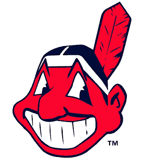
Cleveland Indians (baseball). Naaah, that's not racist, it's kitsch!
Chicago Blackhawks (hockey). See Cleveland Indians for comment and insert here.
Buffalo Sabres (hockey). Never mind that this logo looks like its from the Spanish-American war, who would name a team the Sabres?.
Tampa Bay Buccaneers (football). I think his swash has buckled.
Denver Nuggets (basketball). Ever wonder where the idea for Tetris came from?.
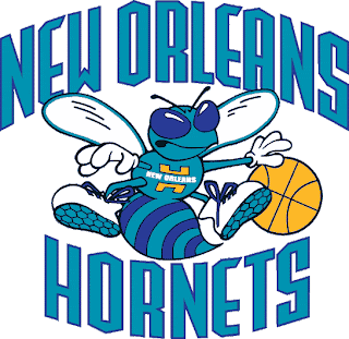
New Orleans Hornets (basketball). That is one angry insect.
Seattle Pilots (baseball). Saving the worst for last. This baseball team only lasted one year (1969), but despite the fact this team is long gone this logo is so bad I had to include it.


Tidak ada komentar:
Posting Komentar