 Light in an average room is three times darker than outside. The eye is remarkable for its ability to compensate for low lighting, so you don't even notice. But the eye gets tired three times quicker and your mood is three times as unhappy. Passive solar strategies can brighten things up, and significantly cut energy costs carbon-emitting fossil fuel usage.
When I visited Lockheed Building 157 as a kid, I immediately noticed something different. Light shelves brought light deep into the building and people congregated for lunch in outdoor atriums. The design cut energy usage by 75% and saved $500,000 in the first year. Studies found that additionally workers in that building were twice as productive because they were more motivated.
Here are some easy tips to bring natural light into your home, office, or other building type.
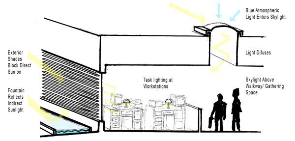
- The height of your window should be one-half as tall as the width of the room that you want daylighted. The amount of light in that space will be just right.
- Workspaces, such as desks, should be next to windows that bring light in sideways. Any place that requires reading or attentive looking should also have artificial task lighting.
- Hallways and lobbies need tall skylights that bring in bluish light from the sky. Intimate or work spaces need orange light from the sun through windows.
- Direct light from the sun heats things up quickly and causes extreme glare, so use external shading devices to tone it down. Bedrooms and private spaces of course should have less light.
- More info here

2.Get rid of roof gutters!
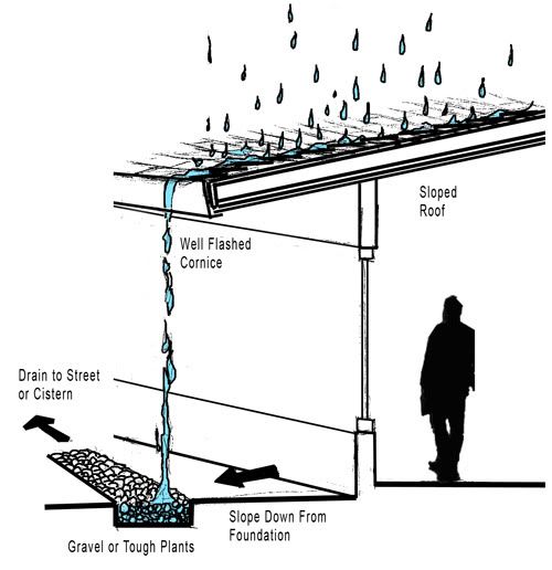
My home growing up didn't have any roof gutters. The slope of the roof would drain the rain water into valleys, and then just pour down onto the ground below and flow down a concrete path onto the street. We planted tough plants where the water pounded the ground to prevent erosion.

Roof gutters prevent damage to the roof, the side of the house, and the ground below. But think of what benefits to they take away! I remember watching through large kitchen windows as the water poured off the roof. It was beautiful. The noise was actually soothing, and it made a rainy event so much more significant in my memory, like dancing in the rain without getting wet.
 Also, roof gutters freeze and rust. Roof gutters get clogged and need to be cleaned. All you need to do is place plants or gravel where water from the roof falls, which adds health and aesthetic anyway, and then give it a pathway to drain onto the street. Or if you're really gutsy, let it drain into a barrel to be reused later for watering plants, which will save on your water bill.
You do need to be careful about the edge of the roof, that the rain water doesn't creep up underneath the shingles or damage the eaves. I also recommend something to prevent water from dripping in front of doorways and pathways.
3.Make an interesting driveway.
[a]
 Look at the front of any house and you will see that usually half of the front yard is taken up by a drab concrete drive-way. This is very much a “lost space” because people do hardly anything there except drive across it. It also makes the home uninviting because one must walk up this cracking white mass to get to the front door.
Set-back codes require a minimal distance between the sidewalk and the garage, but be creative with what you do there. Brick or cobblestone looks much nicer and will last much longer. Grass can grow in between the stone blocks to add some natural element and to stop much of the rain run-off.
The driveway becomes part of the procession to the front door, and part of the greenery that makes a front yard so enjoyable.
The same concept can apply to any building's parking lot. Oftentimes the experience of going to a store is ruined even before you even walk in the door. You have to search the precarious parking lot for a free space, exit your car into the boiling hot and dirty parking lot, and walk through the paved maze to the store entrance. How hard would it be to just have some trees for shade and cobblestone for common pedestrian routes?
4.Get cleaner air, naturally warmed or cooled!
The air inside a building is usually much less healthy than outside air. Ancient Greek architects placed heavy importance on what kind of air enters and how it circulates through a building, something that led to Feng Shui.
It's incredibly easy to bring healthier air into your building and save money on heating or cooling:
- Never recirculate air from inside the house. Always bring in fresh air from outside. Ducts should be as short as possible, without turns, and cleaned often to get rid of harmful dust. Buildings almost never have enough air circulation so really vamp it up!
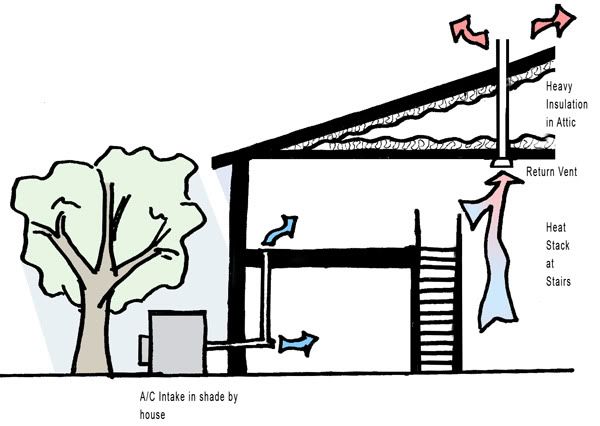
- How often do you see air conditioning units sitting out in the sun? Probably 99% of the time. Cool the air down before it even enters the unit by placing it in the shade. Then it will also be out of sight. You could cool the air in sub-soil pipes before it enters the unit.
- Natural circulation from windows and fans is much healthier than mechanical units, it and naturally cools the house. Nineteenth century homesteaders used ingenious techniques to suck air into homes and out the other side. Tall spaces like staircases will suck warm air to the top where it can be vented out. The air at the top of the building is always much warmer. I will cover this soon in a lengthier blog.
- Circulate air through the crawlspace or basement. Radon in the ground is actually a huge problem. The poisonous material seeps through the concrete slab into your home.
- Place a vent above your oven, dishwasher, and stove. In the summertime keep in mind that the oven actually produces a large amount of heat.
- Place your return vents around incandescent light fixtures. Light bulbs produce a lot of heat and in the summer you might as well vent that out before it heats up the air in the room.
- Insulation in the roof is much much more important than in the walls, because the sun beats down on the roof and because air is warmer higher up. The top of the attic should be insulated as well as the base. Thin windows are the next most common culprit for bad insulation. If you plug any drafty element, like a window or door, keep in mind that this makes the air inside more stagnant.
- Place all shading devices outside, not inside. Window shades are completely useless for preventing heat gain because the sun hits the shades and is transferred into heat- which stays inside. Most German houses have rollable shades on the outside that completely block light, and plenty of cold or heat, from getting in.
- Be creative with the roof. In history and in other countries, the roof was often a heavily used space. Just like the driveway, the roof is a “lost space” in today's culture. But growing up I found it a very fascinating place- in the bright sun, high in the sky, out in the open and yet somehow private. Green roofs, roofs of planted sod, are increasingly popular. Photovoltaic or water-heating panels also make good use of the roof. But why not just make much of the roof a deck to walk around on, bringing you out to the fresh air?
- Place fish tanks in front of windows that receive direct sunlight. It looks cool, and water is good for mitigating temperatures- cooling it down when it's warm and warming it up when it's cold. Concrete and masonry also does this, so a bulky fireplace will actually help with your heating and cooling bills. Heavy materials and insulation also block noise.


5.Use less paint!
Renaissance architect Andrea Palladio hated white paint. There's really something to be said about honest materials. Paint looks plastic, feels plastic, chips, and gets painted over.
[b]
 Do interior walls have to be drywall? The interior sheathing needs to be fire resistant, well attached, and... well that's it. Work with the fire code to develop a wall system that has interesting materials on the inside. Wood paneling, plaster, even steel sheets can make it really interesting.
Structural honesty also makes a pleasant environment. What if you could see where wall studs are? What if you could actually explain to someone where all the beams are and how they hold up the roof? You would probably feel safer and appreciate it a little more.
Glues and stains often emit toxic gasses, so avoid them whenever you can. Many plastic and fabrics are very flammable.
6.Use less carpet!
 I think people have figured this one out. Carpet is harder to clean, it wears out quicker, and it is a fire hazard. Many don't know, however, that carpet is also a breeding ground for allergies and germs.
Hardwood floors are often used because they look nice and feel nicer than concrete. But you would be surprised how nice a cheap veneered wood sheet looks for a floor. Ceramic tile, and even stone also feels pleasant under the feet.
Frank Lloyd Wright often put heaters under the floor so that the room is heated from the bottom up. Many of these alternate materials, especially concrete, work well with that.
7.Don't imitate the sun with electric lights!
 Florescent lights in any office building try to give an even light across the ceiling without glare and without you even noticing they are there.
Why? All you get is a cold flickering light that is hard to see things in. Bluish florescent lights filling a ceiling is like a blue sky without any sun: it's a cloudy day.
Wall light fixtures are almost nonexistant these days. Why? Rather than spreading several light fixtures around a room to get even light, people place a cheap chandelier light fixture in the middle, which inevitably leaves uneven light and glare.
So how do you get a good balance of warm light and cool light, and how do you get it even? The first answer is to bring in natural light from the sky and sun, and just to add some task lighting. The second answer is to stop imitating the sun! Let people know that light is coming from a mechanical source. Light fixtures should express how electricity transfers into light. It's okay to use indirect light fixtures, but then remember that these emphasize the roof or wall material as the light source, and the roof or wall should then be designed as a light source.
8.It's all about the transitions!
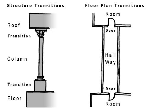
 The ancient Greek column is rather plain except for decoration and design at the top and bottom of the column where it met the floor and ceiling. They understood that expression in architecture is most effective at transition points.
This is a lost art today, as structural expression gets lost in minimalistic walls, floors, and ceilings. The same is true for transitions between spaces. The ancients had dozens of rooms separating their sacred temple rooms and the open outdoors. Today, a common door or window separates our most important spaces from the outdoors.
To really activate the architecture of any building, one must consider how the doors and windows relate two spaces. A bare sliding door, for example, is much more inviting to the backyard than a curtain-covered window.

It's not by chance that people tend to place family portraits along a staircase. This transition between the public first floor and the private second floor of a home is a great place to celebrate the family. How can it be taken further? The fresco-studded doors of cathedrals uber-decorated palaces of Europe can be great examples for placing emphasis on decoration and design at transition points.
9.Surround your building with trees and bushes.
Leave a little space between the planting and the house, and use plantings that don't become dry and flammable.
Place the trees specifically to block dominant winds, noises, and views. Deciduous trees do a lot to block sun in the summer time and let in sun in the winter.
Bushes can add security, but they can also give predators or burglars a place to hide, and they can become a fire hazard. Trees can also provide a way for a burglar to climb up to a second story window.
[images: Architecture Revived,
Tidak ada komentar:
Posting Komentar