[h]
Ever since the invention of the printing press and the rise of literature, architecture faded as a method of artistic communication. Victor Hugo lamented, “Architecture is dead, irrevocably dead, killed by the printed book.”
[1]Robert Venturi referenced Hugo’s claim in an admission that architecture’s artistic communication had indeed been skewed. Yet he strongly disagreed that “architecture left to itself, abandoned by the other arts, because human thought has deserted it, must employ the artisan in default of the artist.” Human thought had abandoned architecture only because architecture attempted to create culture rather than communicate its image. The role of the architect could once again be significant by how he engages art and human thought.

[a]
Venturi sought to connect human thought with architecture in order to retain its artistic necessity. Human communication, like in literature, was essential for architecture. Philip Johnson likewise asserted, “Today, architecture is not acknowledged as basic to human activity… Our thinking is dominated by the word… Yet values can change… architecture, as in all the world’s history, could be the art that saves.”
[2] These Post-Modernists used cultural and symbolical references eclectically to communicate in architecture, overturning Modernists ideals. Post-Modernism's emphasis of artistic communication returned architecture's focus to aesthetics and image, which Johnson and Venturi achieved by different means. Focus on aesthetics made architecture a medium of communication rather than the source and its timeless purpose became once again to serve culture rather than dictate it.
It's About Cultural Image, Not Morality
[b]

Venturi and Johnson ignored moralism as they concentrated on aesthetics and image. This often clashed with the "reformation" effort of Modernism that sought to influence culture. Robert Venturi assimilated the new big cultural influence- “counter-reformation” art into architecture by considering the values of Las Vegas’ flashy, theatrical atmosphere. Las Vegas’s sea of bright signs clashed with Modernist ideals of pure form. In the introduction of his book ‘Learning from Las Vegas,’ he asserted such art was valuable strictly for its “architectural communication”, that “as the analysis of the structure of a Gothic cathedral need not include a debate on the morality of medieval religion, Las Vegas’ values are not questioned here…”
[3] He refused to sacrifice culture for a moral agenda.
The morals of Philip Johnson were also questionable, for example his well-known ties to Nazism. Johnson maintained it was the power of the Nazis that was so attractive rather than their ideals, and when his attention turned to architecture, he remained affixed on the powerful display of an edifice, the aesthetic quality rather than the social, economic, political, or moral values.
[4] As Venturi was focused on culture, Johnson was focused on power. He was a romantic architect, and for this reason he was impressed by “pageantry- the leather jackets, the parades of goose-stepping soldiers, the nocturnal rallies with search lights scanning the skies- at which the Nazis were so skilled.” The fixation seemed to reflect his own career, as he was more significant in how he talked than how he produced architecture; he was a celebrity who produced celebrity architecture, achieving greatness mainly by talking.
[4] Likewise, his designs aimed for greatness by their image rather than by some profound innovation.
It's about Impression, not Function
[c]
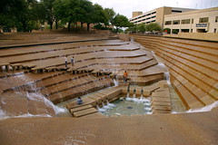
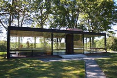
Post-Modernists went on to question Modernism’s purity and pristine demands, starting with throwing out the notion that form depends on function. Philip Johnson studied at Harvard University under Walter Gropius who had Bauhaus training, but made a huge splash in the architectural world when he declared that aesthetic image and monumentality of a design are more important than functionalism. He concentrated on how one viewed the building, including his “procession”, or experience as he moved through it. He played with how the occupant might be tricked; taking advantage of what he expects to him comfortable, something which he called “safe-danger.” His design of the Kirstein Tower included high steps with no railing, giving the user a precarious feeling. The steps of his Fort Worth Water Garden design included a chasm with water running through it. Such sublime devices helped restore architecture’s subliminal influence on people, more so than mere function.
[5]As well as influencing him as a romantic, concentration on form led him to integrate landscape and natural surroundings into his design. Even though function was less important for the form, the context of the building was all the more pertinent. He was impressed by how Frank Lloyd Wright used landscape to produce an effect. His first major work, the Glass House, took advantage of its natural surroundings and created a wonderful overall impression in this way. The little building was entirely framed glass, in which the outside of the building greatly influenced the inner dwelling.
Complexity and Contradiction
[d]
Venturi also valued continuity between the inside and outside of a building, finding this a major opportunity for contradiction in architecture, something which he championed in his ground-breaking book ‘Complexity and Contradiction in Architecture.’ He stated “The inside should be expressed on the outside,”
[3] because a building's context changes the meaning of its form. Johnson worked with Mies van der Rohe whose slogan was "less is more," and also had minimalist tendencies himself as he used straightforward forms to achieve aesthetics. Robert Venturi agreed that form is superior to function, but disagreed with Johnson on minimalism and declared "less is bore."
Venturi’s book "Complexity and Contradiction" elevated him to greatness in effecting change in the architectural world.
[6] It became an important benefit by throwing out the dependence on function. Once again things could be multifarious. Venturi revived the Baroque inclination to change things around merely to discover a more interesting form. In ‘Complexity and Contradiction’ he boldly stated:
"I like elements which are hybrid rather than “pure,” compromising rather than “clean,” distorted rather than “straightforward,” ambiguous rather than “articulated,” perverse as well as impersonal, boring as well as “interesting,” conventional rather than designed,” accommodating rather than excluding, redundant rather than simple, vestigial as well as innovating, inconsistent and equivocal rather than direct and clear. I am for messy vitality over obvious unity. I include the non sequitur and proclaim the duality."[6]
[e]
He allowed social or economic issues to exist rather than designing them away, for the design was about the impression over anything else. The entire complexity and contradictory nature of culture was in the impression. Johnson was a romantic, but Venturi was an impressionist, looking for how all the details could create a visual whole. In searching for “image- image over process or form,” Venturi considered how symbolic or representational elements may contradict the form, structure, or program of a building. He gave two examples. The “duck” building’s space, structure, or program is distorted by an overall symbolic form, for example a building shaped like a duck. The “decorated shed’s” space and structure is at service of a program and ornament is applied independently. This is like a shack that is prettied up to sell T-shirts at the beach. Both are contradictory in design, but the important thing is that they use past experience and emotional association rather than function to achieve the form.
[3]Quoting Icons of the Past
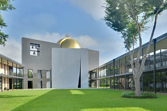
To create a perceptual whole, both Venturi and Johnson utilized past styles and edifices. Venturi worked with the history of architecture, specifically Italian Mannerism, French and German Rococo, and the Early Modern works. He referenced Isfahan, Samarakand, and Samarra styles to respond to Islamic architecture in his design of Iraq’s State Mosque.
[3] He looked at the forms independent of their specific cultural or historical significance, and all that mattered to him was how they might contribute to the perceptual whole experience of his project.
[f]

Johnson looked at European architecture, particularly Germany’s International Style. He leaned classical in his eclectic choices, and was always varied and indiscriminant. But he was consistent in that he looked at history for impressive forms.
[5] He appeared with Hitchcock in the Museum of Modern Architecture in 1932 and was monumental running the museum through the years. This showed his dedication in keeping the body of architecture through history intact in people.
He looked at Duchamp’s varied juxtaposition of scales in his art piece ‘Drunken Rook’ as inspiration for the contrast of between the larger than normal lamp posts and his tower on Boston 500 Boyston Street. With his Guadalajara, Mexico project he manipulated Platonic solids for his forms. For the famous cap of his AT&T Building in New York, he looked at the broken pediment at Petra in Jordan. He sought a formidable entrance, based the façade on Brunelleschi’s Pazzi Chapel,
[6] and re-established the stone clad buildings that New York used to know.
[5]New Perceptions of Old Functions
Venturi was interested in the lost art of using symbols in architecture for human communication. He used the symbol of a window frame on the outside façade simply to accentuate the window’s appearance. But he went further in using symbols, searching for symbols that might be used out of their normal context, like the duck building example, and how they might effect the viewer.
Such rearranging of form, he said, changes the architectural meaning: “Familiar things seen in an unfamiliar context become perceptually new as well as old.”
[3]) Thus, all styles could be used, according to the tastes of society. It was up to society, the social or technological relevance of the day, to decide which elements were relevant to the design.
As an example of this, he referenced electronics, calling that the “relevant revolution today”
[3] in a sculptural design of antennas. This showed that if books had killed architecture, television and other recent media advances were to kill the book. Literature, architecture, television, and all other media had important relationships in art. One could be a symbol in the other’s communicating. Like the book uses symbols to convey messages, and as Cathedrals used statues and other symbols to communicate, Venturi found such symbols to be timelessly relevant to architectural design. Hugo was the first to connect symbols with architecture: “Architecture… developed with human thought; it became a giant with a thousand heads and arms, capable of holding in on visible, tangible, eternal form all this floating symbolism.”
[1] And so, his architectural references to history and symbols were what made Venturi’s buildings artistic, and his ability to eclectically design generated forms that were interesting to the people.
The Ghost of Architecture
[g]
When Venturi looked upon Modernism and found that what Hugo had predicted was true, that “this architecture… survived only as a specter, a shadow,” that it was “decrepitude and decay,”
[1] what was he to do? In his Franklin Court project, he built a “skeleton” where Benjamin Franklin’s house once stood, called it a “ghost structure,” and said, “Might not this ghost also symbolize the death of architecture predicted by Hugo?”
[3]For him and Philip Johnson, architecture was still an essential art, which could be saved by admitting that its ability to communicate determined its livelihood. They didn’t attempt to create a new movement; indeed Venturi always removed himself from any ties with the “post-modernist movement.”
[3] But they returned Modernism’s focus to aesthetics through various means, by removing the moralist, social, and political baggage, and the dominance of function over form, and by applying complexity and contradiction to engage the occupant. The use of symbols to communicate, they found, was timeless for this art, and history could be used to find forms which effect people. The final form of the edifice was its saving grace as art, and as the book is essential after the advent of television, so architecture will always be essential to mankind.
It is an art that goes with trends rather than sets them, that reacts to and maintains culture. Can this attitude keep architecture alive, or is it just prolonging the inevitable death? Postmodernism suggested architecture may in fact already be dead, but is still so important to mankind that even its ghost is the art that saves.
[Images by:
^laffy4k- flickr/cc license
^paukrus- flickr/cc license
^garryknight- flickr/cc license
^BFS Man- flickr/cc license
^jskrybe- flickr/cc license
^euthman- flickr/cc license
^roryrory- flickr/cc license
^kjarrett- flickr/cc license
Sources:
^Victor Hugo “The Hunchback of Notre-Dame” Tom Doherty and Associates, 1996 pages 158, 160, 169, 171
*See Robert Venturi’s Reference to Hugo in “Venturi, Rach & Scott Brown” by Stanislaus von Moos (3) ^The Pritzker Architecture Prize, "Philip Johnson” 1979 www.pritzkerprize.com, Retrieved 2005^Quoted from Stanislaus von Moos "Venturi, Rauch & Scott Brown" Rizzoli New York 1987 pp. 11, 12, 13, 15, 64, 70, 74^Frank Schulze "Philip Johnson: An Essay by Frank Schulze" Architecture Record. http://archrecord.construction.com Retrieved 2005 (no longer found)^Philip Johnson, Hillary Lewis, Richard Payne, Stephen Fox “The Architecture of Philip Johnson” Anchorage Press 2002 pp.4^As quoted in Marian Moffett, Michael Fazio, Lawrence
Wodehouse “A World History of Architecture” McGraw Hill, 2004. pages 542,544